Hotspots Tab
Use Hotspots to place information markers on the selected object and to edit the shopper-facing product card.
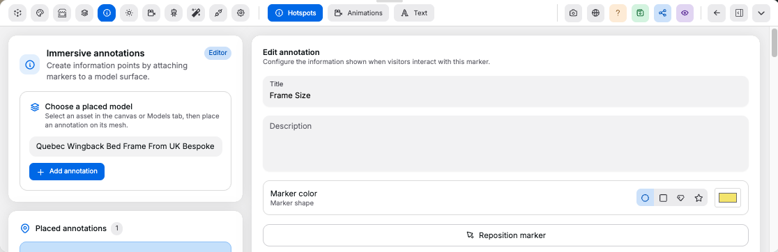
Marker#
Controls:
Add hotspot: creates a new marker on the selected objectPlaceorReposition: enters placement mode; click a model surface to set the marker anchorMarker color: changes the visible marker colorMarker shape: changes the marker iconSelectable: includes the hotspot in shopper navigation and hides the product card while its annotation card is open
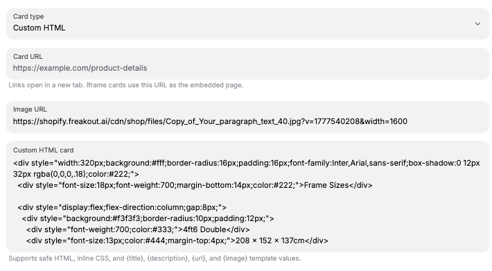
Card#
Controls:
Title,Description,Image URL, andURL: populate the shopper-facing card contentContent type: switches betweenDefault,Custom HTML, andIframecardsDisplay card on: opens the card onHover,Click, orFocusCard placementandCard offset: position the card on desktop; mobile opens cards as resizable half-height bottom sheetsConnector style: choosesLine,Dashed line, or no connector between marker and cardConnector color: changes the connector color; defaults to the marker colorAction: adds a button to the default card that runsTurn on cameraorConnect agentDefault card layout: chooses image placement, image alignment, and text wrappingIframe settings: sets iframe width,allowpermissions,sandboxtokens, andreferrerPolicyCustom HTML: accepts safe HTML with inline CSS and the template values{title},{description},{url}, and{image}
Custom HTML example:
<div style="border-radius: 20px; background: #111111; padding: 24px; color: white;">
	<h3 style="margin: 0 0 12px; font-size: 24px;">{title}</h3>
	<p style="margin: 0; line-height: 1.5;">{description}</p>
</div>
Highlight and Color#
Controls:
Shader effect: highlights the targeted mesh withPulseorGlowwhile the card is openShader color: changes the highlight color; the editor preview tracks this swatchColor picker: adds swatches that let shoppers recolor the targeted mesh or material slot from the annotation card
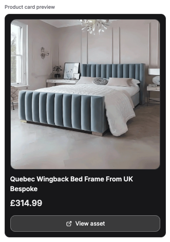
Product Card Data#
Use the product card data panel to make the selected product or uploaded model selectable in the shop viewer.
Controls:
Product title,Image URL,Store URL, andPrice: populate the shopper-facing product cardProduct IDandShopify ID: optional identifiers for matching external catalog dataSelectable in shop: lets the viewer stop on this product or asset and show its product cardSave product dataorSave asset data: saves the card data before publishing
Good to know:
- Both products and uploaded models support hotspots; published rooms render them in the shop viewer
Store URLandSelectable in shopare required for supplier-style navigation- Product and asset card data are edited from this same tab
- A live product card preview appears before you save
Custom HTMLis sanitized; unsafe attributes and URL-based CSS values are strippedIframecards still respect the destination site'sX-Frame-OptionsandContent-Security-Policy: frame-ancestorsheaders